Transforming a Legacy Health Analytics Platform - 2 rebrands, one foundation
Product goal
Health analytics dashboards so hospitals and employers can assess members’ health spending through robust offerings of reporting
Update legacy to modern interface
Business goal
Create a consistent experience for this newly acquired company with the main product line. Keep customer retention high for the existing customers
Team
Design owner working with a PM and 2 Engineers, who come from the acquired company - APH
Theme
Health and wellness, data visualization, healthcare analytics, rebranding, dashboards
My responsibility
I worked on a fast-turnaround dashboard interface project, focusing on clarity, visual hierarchy, and scalable UI components. Within a 2-month time constraint, I was responsible for the design system and full platform redesign. It taught me to balance urgency with interface consistency and address scalability and branding.
Design audit
Define the design goal, given the business goal
Create design system documentation with spec for handoff
Design QA

Faced with ambiguity
The initial goal was to rebrand the full platform, and nothing else was asked specifically. The business wanted to quickly rebrand it to retain customers from this acquired company. The long-term plan was unknown. By talking to the PM, I learned more about the user and the product value to help inform me about the context.
Problem
Legacy product that has no design system. It uses legacy code, old design patterns, and is not responsive.
Who are the users?
Hospital and employers; roles could be Claims Manager, Health Counselor, HR
User goal: analyze large medical datasets to identify patients/employees patterns, therapeutic targets, cost, and risk factors.
Design goal: to create visual alignment and modern interface based on our new branding guideline while improving UX for usability.
1. Design audit
My first step was to audit the old platform, which includes 30+ pages to identify UI and usability issues.
I approached this in 2 steps:
Identified usability issues using heuristic evaluation
Clustered them into patterns (navigation confusion, inconsistency, etc.)
After this, I informed our team to address the inconsistencies as well as improving UX, and develop a design system.
2. Set up my design system to 60% completion and started redesigning for each page.
I refered to the company’s branding guide for marketing and established the design system, where I had the basic components and guidelines to get the design going
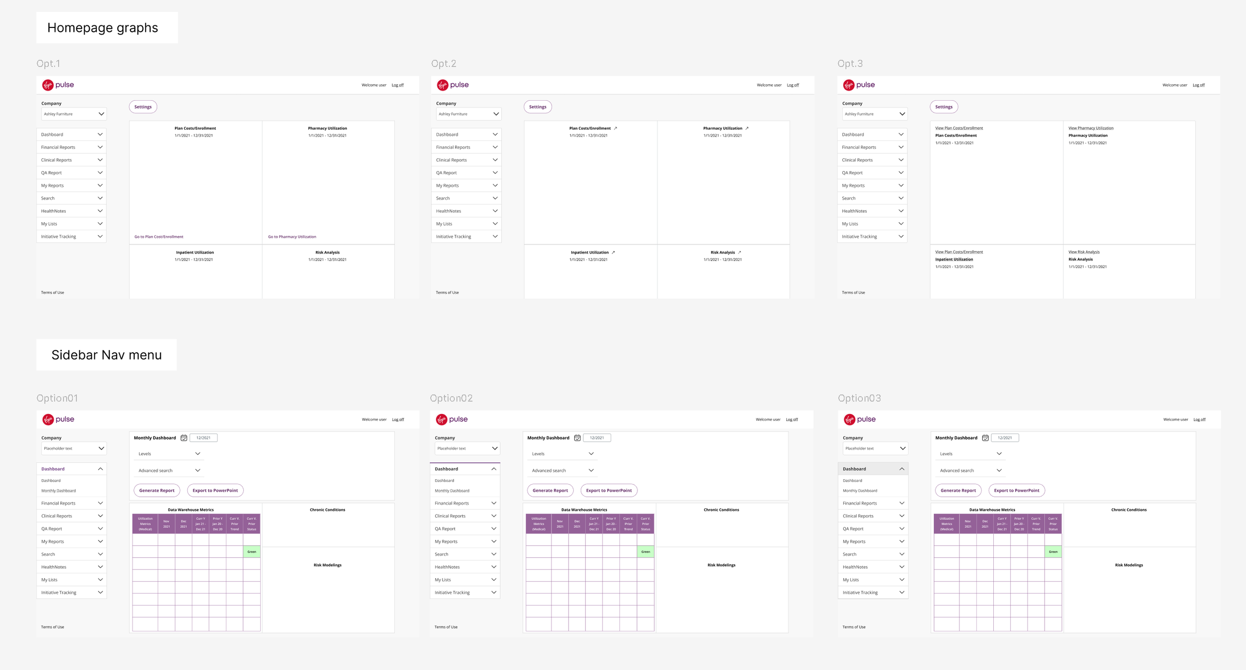
Example of iterations on UI components and info layout
3. Design transformation
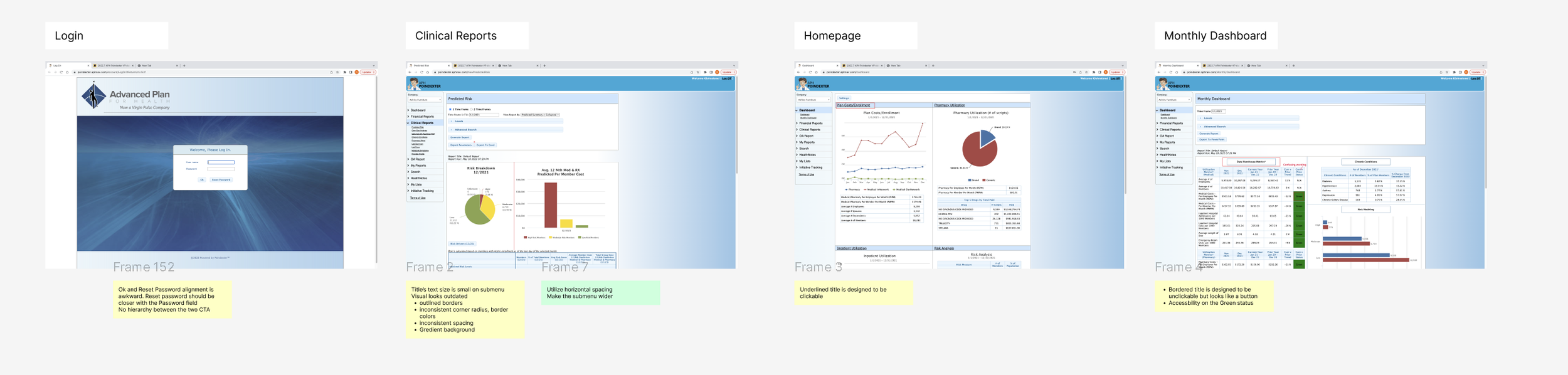
Log-in screen
Before
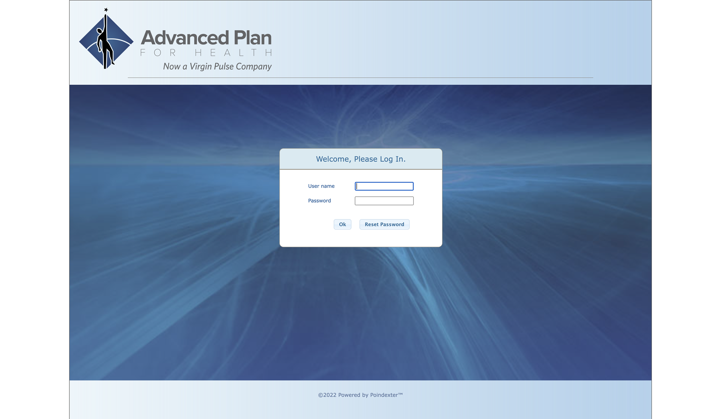
Problems:
Ok and Reset Password alignment is awkward because Reset Password should be closer with the Password field
No hierarchy between the two CTA, and OK button on the left side interrupts with the login flow
After
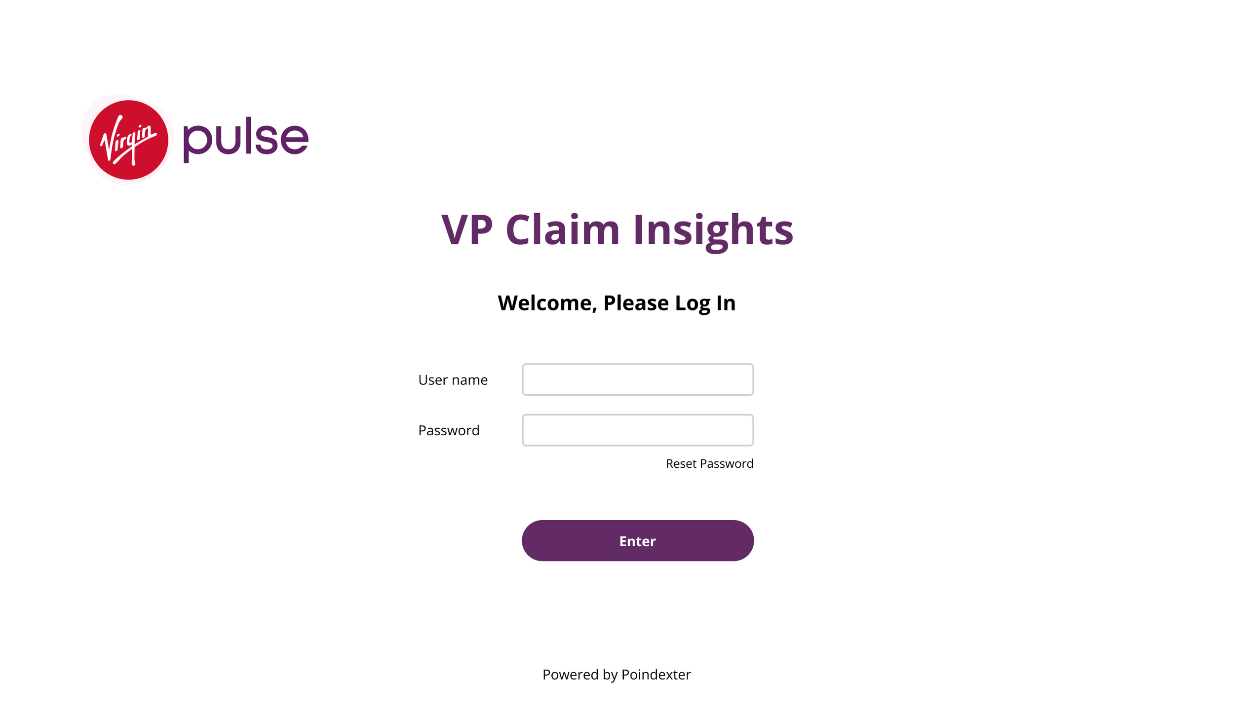
Improvements
Center align content and title to the page
Changed the CTA placement for better clarity and visual alignment
Change “OK” button to “Enter” and highlight as the primary button in the center for a smooth interaction flow
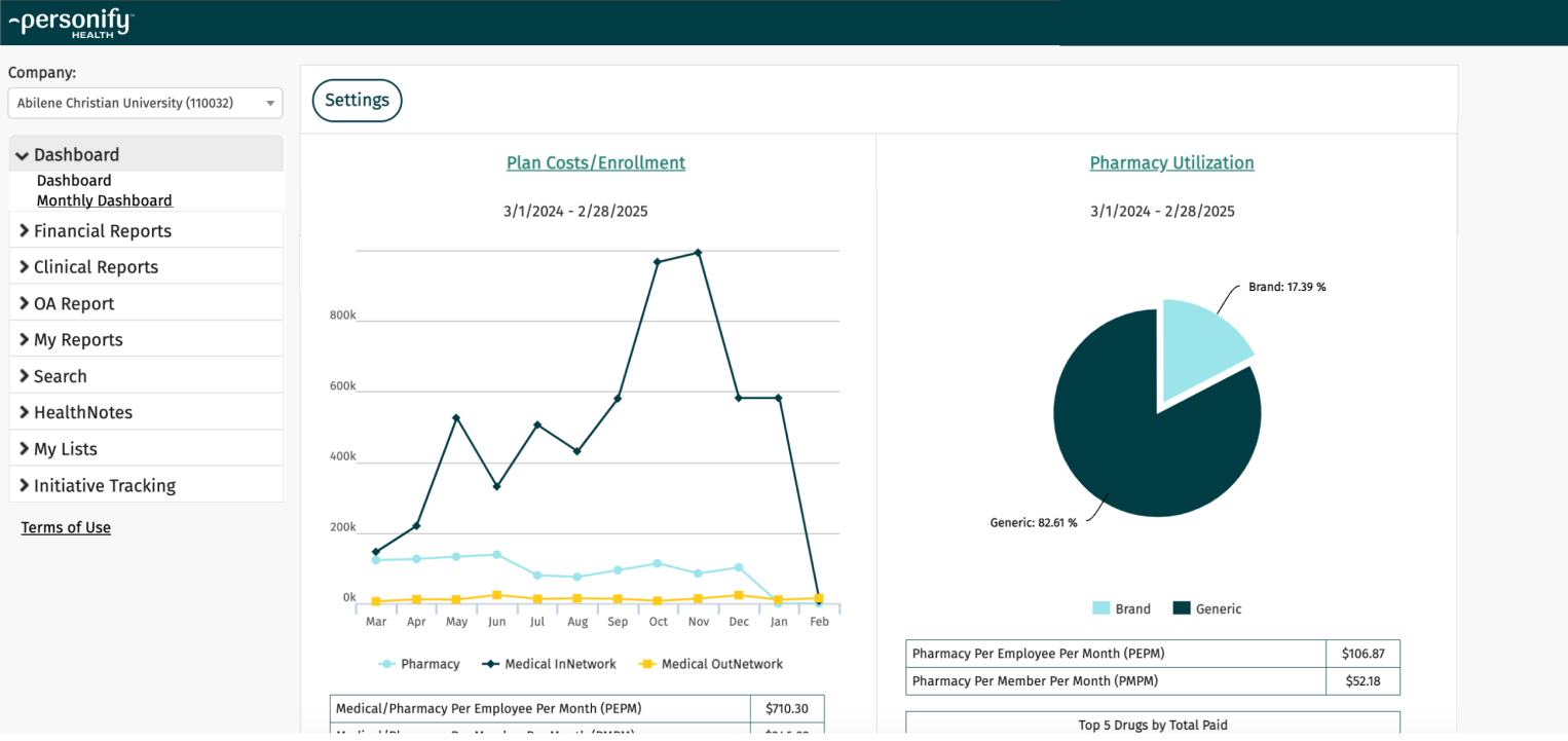
Main Dashboard
Before

Problems:
Sidebar - each pages have the underlines, which can confuse users as they don’t know which page it’s on
Too much white space on a desktop view; web is not responsive
Redundant info in the graph header
The title’s text size is small on the sidebar
Visual looks outdated and inconsistent
inconsistent corner radius, border colors
inconsistent spacing
Gradient background
After
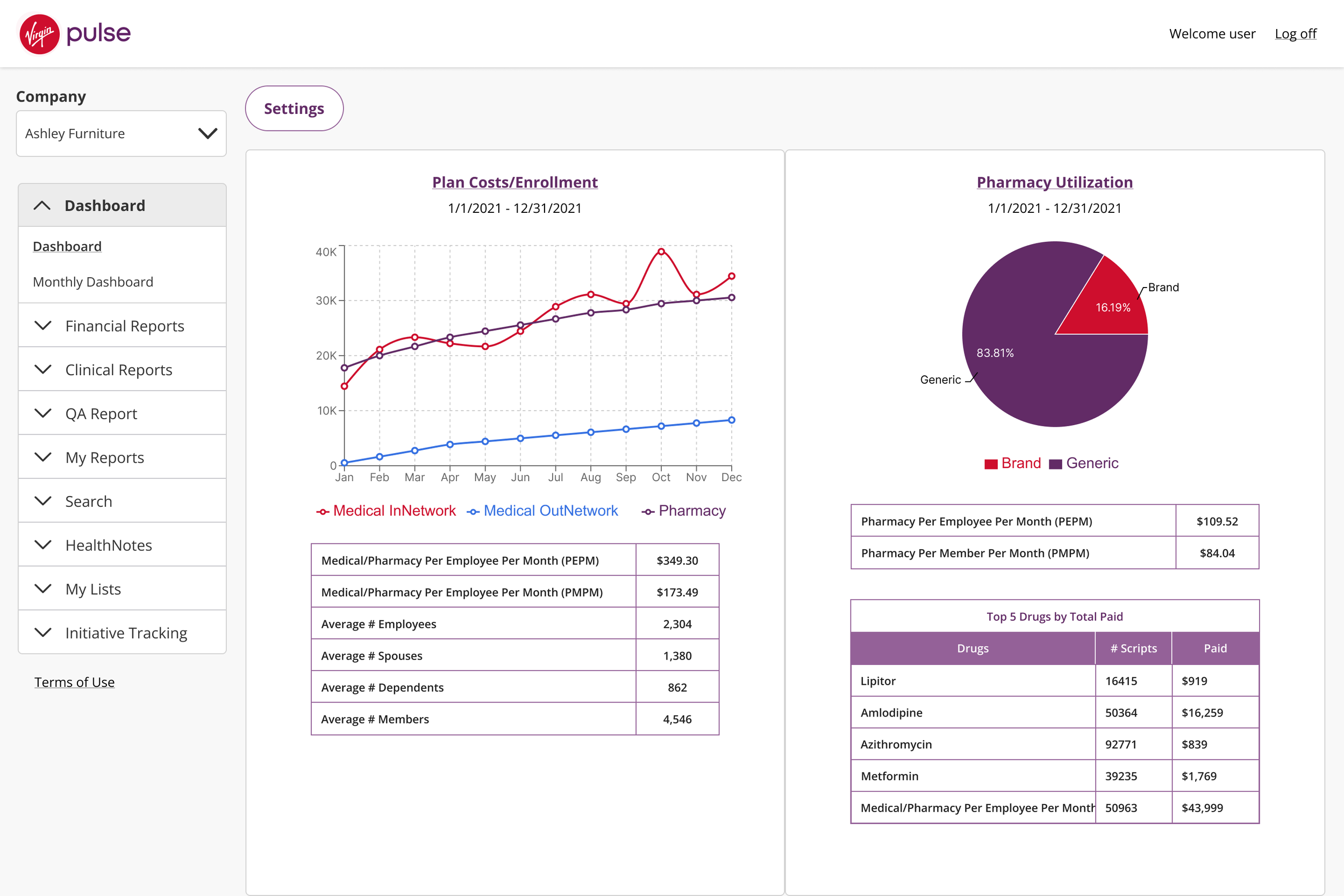
Improvements
Redesign states in the sidebar menu
regular state and active state to make it clear which page it’s activePropose fluid layout to accommodate different devices and be responsive
Make the sidebar fixed in width; Make the main content area to fill the page ; min-width of the graph container: 470pxCombine double titles into a title link to remove redundant info
Increase base text to 14px
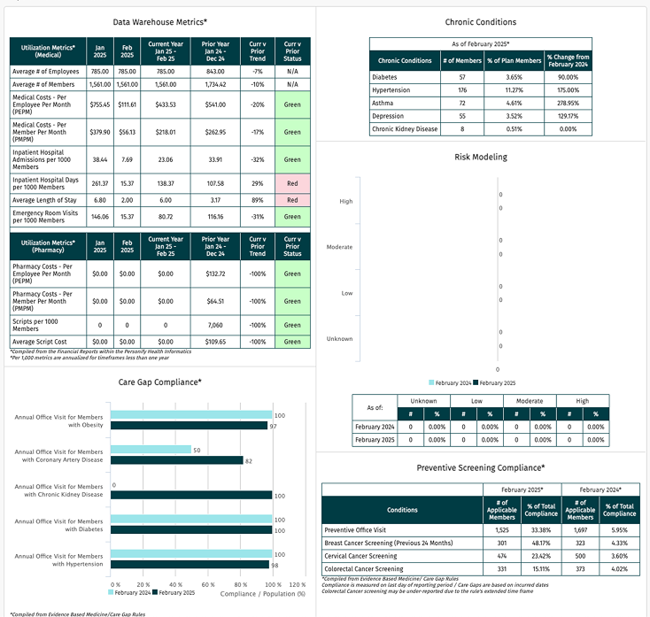
Monthly Dashboard
Before
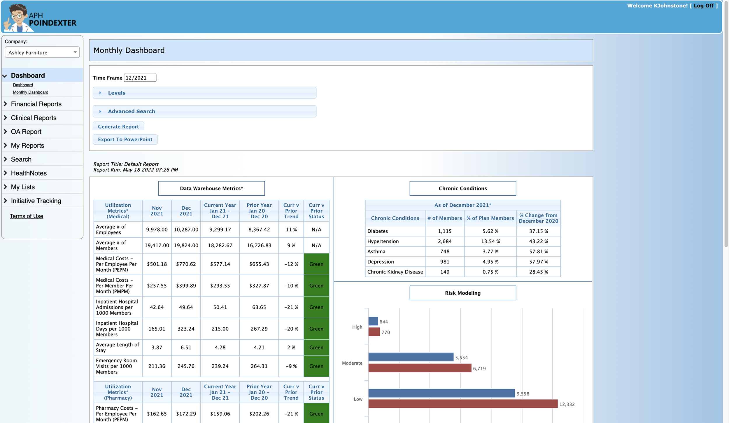
Problems:
Complicated menu
Bad accessibility of the status colors
The border of the title can be confused as a clickable button
After

Improvements
Add a calendar icon to help user recognize that it will open a calendar picker view
Update the status colors to meet accessibility
Remove the border of the header
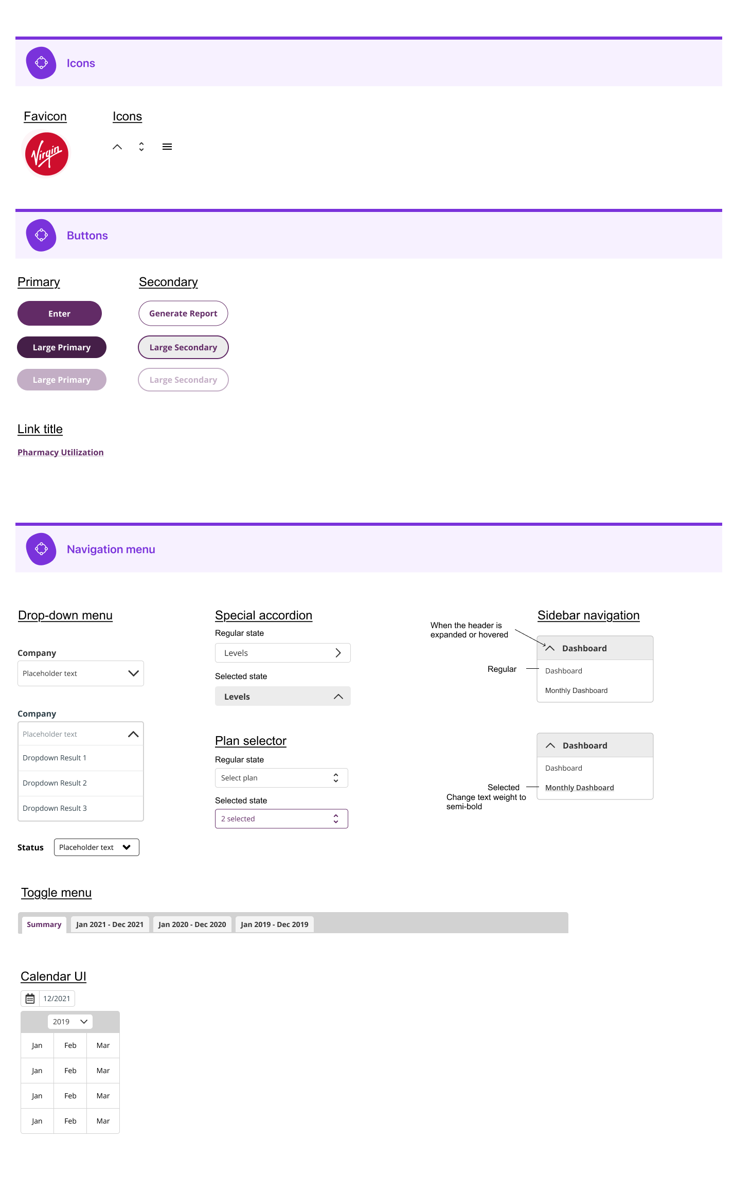
3. Design System documentation
Because the platform has so many different types of graphs, I decided that it was necessary to create a design system to make the best plan for the visual hierarchy and clarity.
Initially, I used the rebrand style guide (main product) for color inspiration and alignment.
This documentation not only serves as a reference book for the engineers, but also helps the team to stay on the same page with rebranding.

That left us with …
Scalable design system logic, which ramped up the 2nd rebranding
Because we had this design system, we were able to quickly rebrand it the 2nd time by just plugging in the primary and secondary colors
Ending a successful collaboration with the PM and ENG
“clear documentation from the designer helps the team move efficiently and bring clarity.”
A boost in customer satisfaction that ended with a 93% customer renewal rate
“They love it!” “They found it easy to use and had a good impression of the brand.” 93% customer renewal